Hacker Newsnew | past | comments | ask | show | jobs | submitlogin

It's useful for people who work with data, like in ml, data science, etc.


Or for sysadmin or anything where a quick plot at the data gives you hints at what's happening.

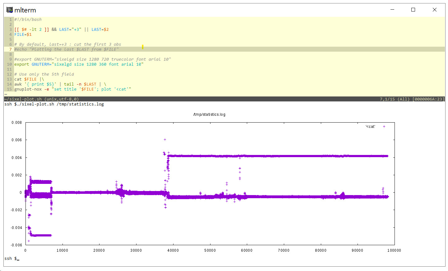
In the example screenshot I put on https://raw.githubusercontent.com/csdvrx/sixel-gnuplot/maste..., I was investigating time sync issues.

A plot immediately told me my first fix had corrected the issue on 2 servers, but I had mistakenly applied the same change to a 3rd one.


Consider applying for YC's Summer 2026 batch! Applications are open till May 4

Guidelines | FAQ | Lists | API | Security | Legal | Apply to YC | Contact

Search: